 Shopify Plus Partner
We ran a full UX Growth Audit — Clarity heatmaps, Shopify analytics, and manual QA across all templates — then prioritised implementation around the single biggest lever: product discoverability. Every customer entering for “low energy” or “focus” was landing on NMN500 and leaving without seeing anything else. That needed fixing at the architecture level, not the PDP level.
Product Discovery Architecture
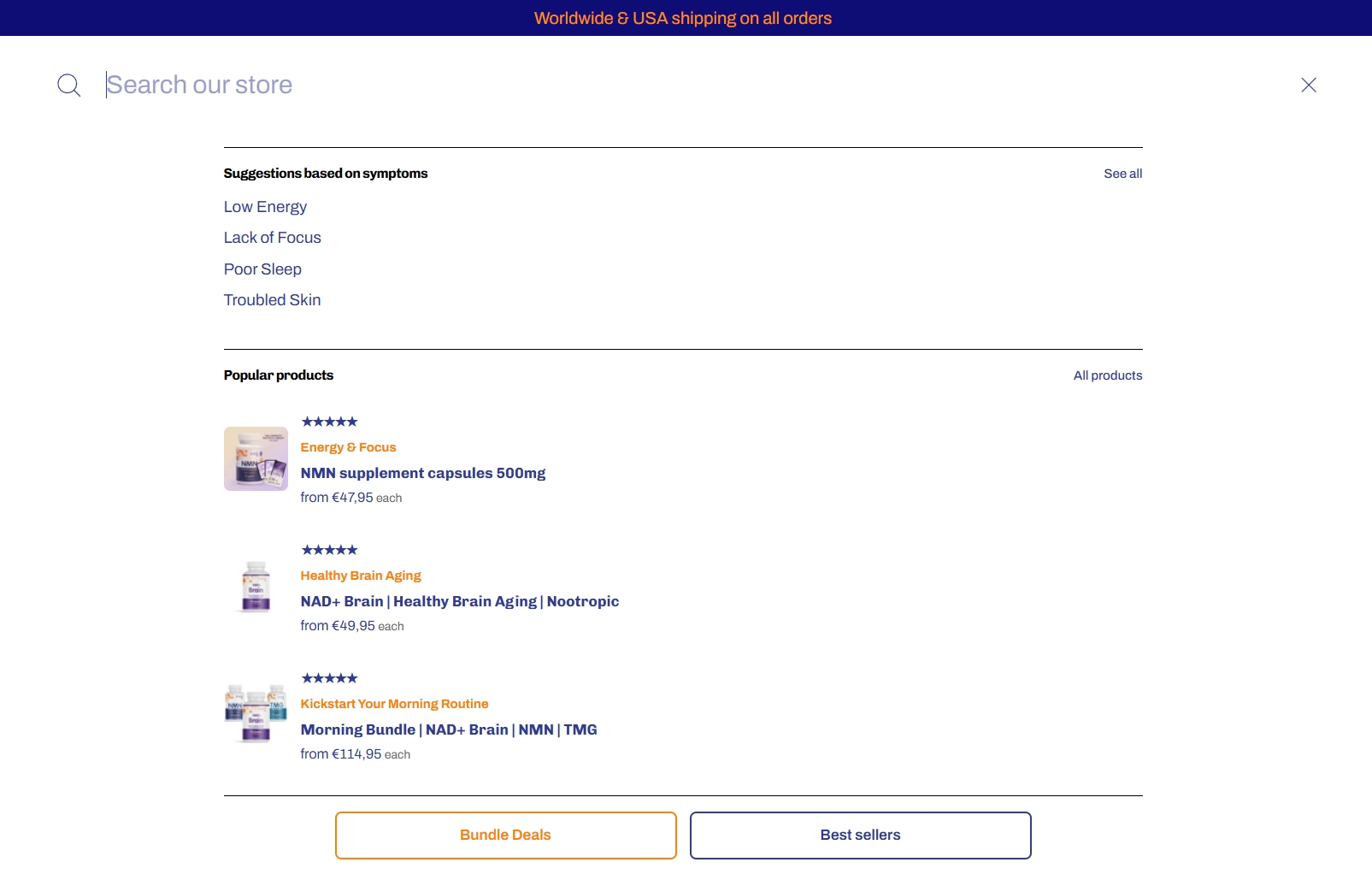
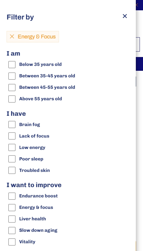
We restructured the homepage, collection page, and search around symptom-based entry points — connecting intent (“lack of focus”, “low energy”) to the relevant collection rather than a generic product list. On mobile, the collection grid was switched to a 2×2 layout with a metafield-based filter system, giving customers a passive way to find the right product without needing to know what it’s called.