
 Shopify Plus Partner
We started with a structured UX growth audit before a single line of code changed. The audit mapped friction points across product discovery, product pages, and checkout — and gave Cookery’s team a clear, prioritised roadmap they could act on immediately. The store had the traffic; what it needed was a purchase experience that matched the quality of the products being sold.
Case study
Cookery Store Shopify CRO & Development — Thails
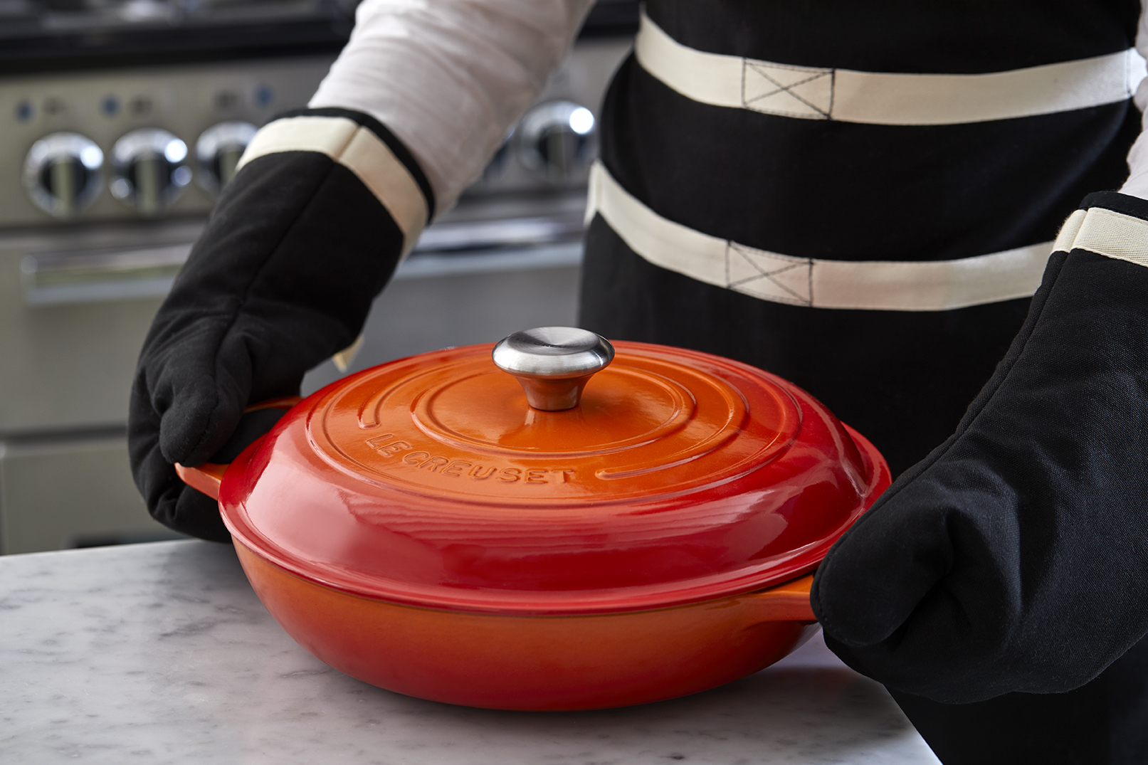
Cookery Store is a Canadian premium kitchen and cookware retailer offering a broad range of professional-grade cooking equipment, books, and culinary resources — all in one store.
Shopify Plus Partner
The Challenge
The Challenge
Cookery Store had a strong product catalogue but the store experience wasn’t keeping pace with it. Product pages were visually flat — single or poorly arranged image galleries, no sticky product details on desktop, and no intuitive navigation between variants. Collection pages offered limited filtering, making it difficult for customers to narrow down within large product ranges.
At the navigation level, the menu structure didn’t reflect the depth of the store’s inventory, leaving categories — particularly content-driven sections like Books and Cooking Classes — disconnected from the main shopping flow. Before committing to a broader development engagement, Cookery wanted confidence that the investment would deliver measurable results. The UX growth audit provided exactly that.
The Project
The Project
Product Page Image Experience
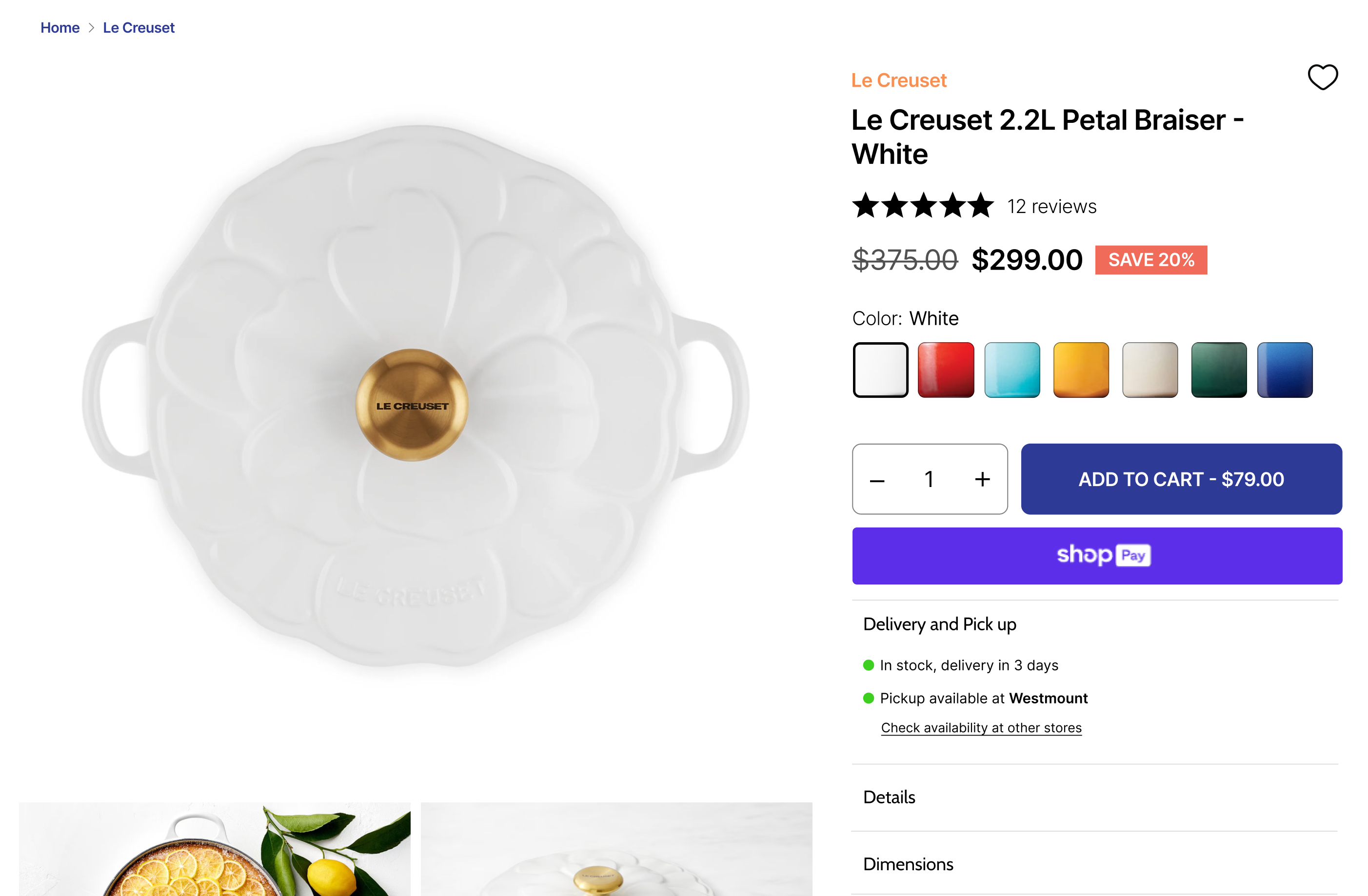
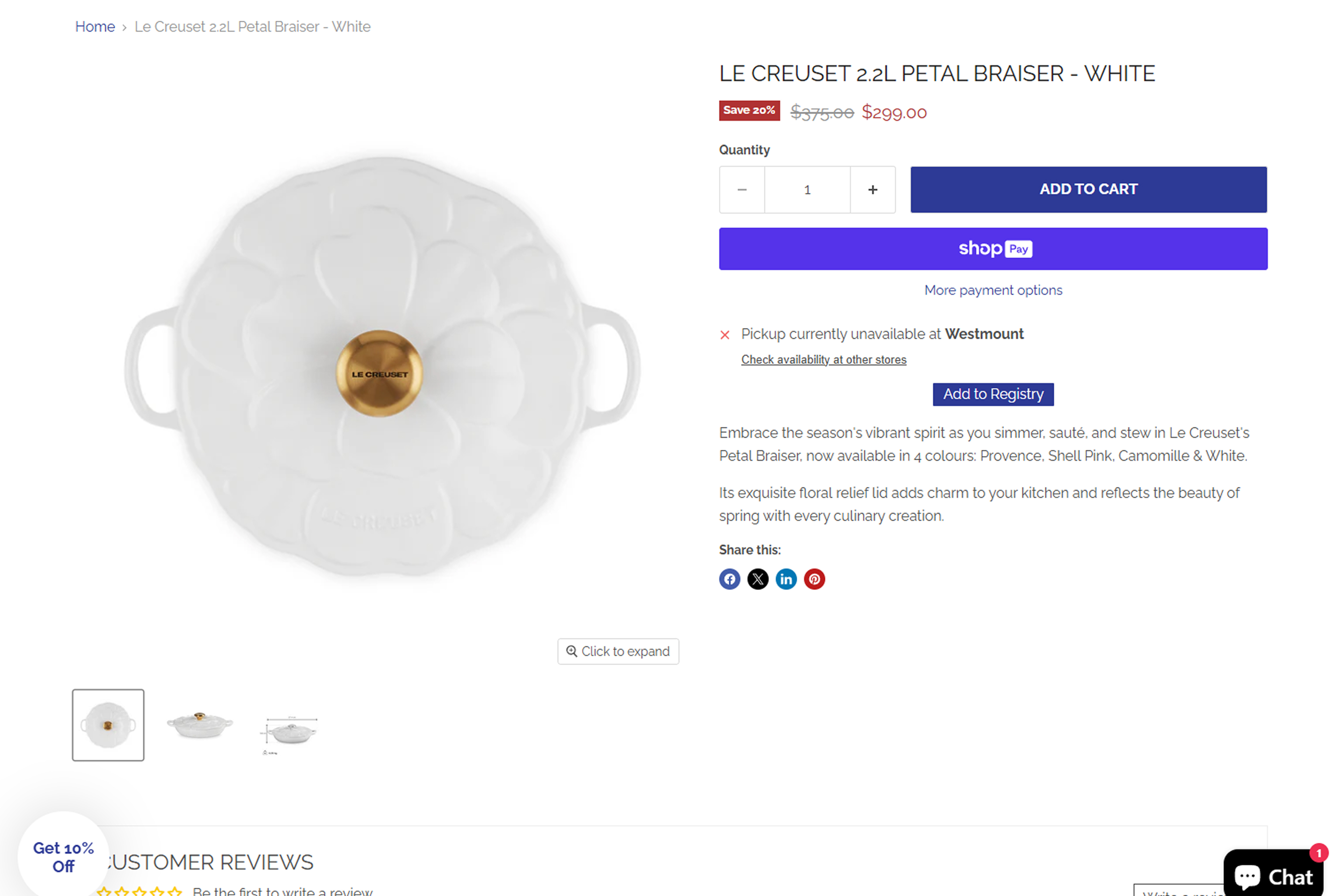
On desktop, we implemented a multi-image gallery with on-scroll sticky product details — keeping key purchase information visible as customers explore product photography. On mobile, thumbnail navigation was replaced with swipe-friendly dots, navigation arrows were added for directional control, and image rendering was reviewed and optimised following Shopify’s best practices for responsive images. Lazy loading was implemented across the gallery to reduce initial load weight without sacrificing visual quality.
Breadcrumbs and Collection Context
We added breadcrumb navigation at the product level, capped at one collection depth (Home > Collection > Product). For products belonging to multiple collections, the breadcrumb and collection link above the title are determined by the closest match to the product’s brand in the title — with a fallback to the first collection in the list. A metafield override allows the Cookery team to manually assign collection context per product when needed.
Variant Selection Architecture
Color and size variant widgets were rebuilt using a metaobject-based architecture. Colors are defined in a metaobject and assigned per product; size groupings link related products through a product-level metafield. This approach keeps variant management within Shopify’s native admin, removes the need for app dependencies, and gives the team a straightforward process for adding new products to the system.
Perfect Match Upsell Section
A cross-sell section was added to each product page, surfacing up to two complementary products. By default it uses Shopify’s generated recommendations — meaning no setup is needed for new products. For key products, hand-picked suggestions can be assigned directly. Items in the section are added to the cart via inline checkbox, removing the friction of navigating to a second product page.
Multiple Quantity Purchase
A variant-based quantity purchase system was implemented, displaying discounts directly inside the quantity selector buttons and auto-updating the displayed price on selection. The setup is designed to be self-managed: one example product is fully configured as a reference, and the Cookery team follows the same process for each product they want to activate it on.
Collection Filter System
We rebuilt the collection filtering experience using a combination of product metafields, tags, and product details. The system is modular — new filter attributes can be added by tagging products or populating metafields, without changes to theme code. This makes it practical for a catalogue of Cookery’s size and gives the team a clear process for maintaining filter accuracy as inventory grows.
Navigation Rebuild
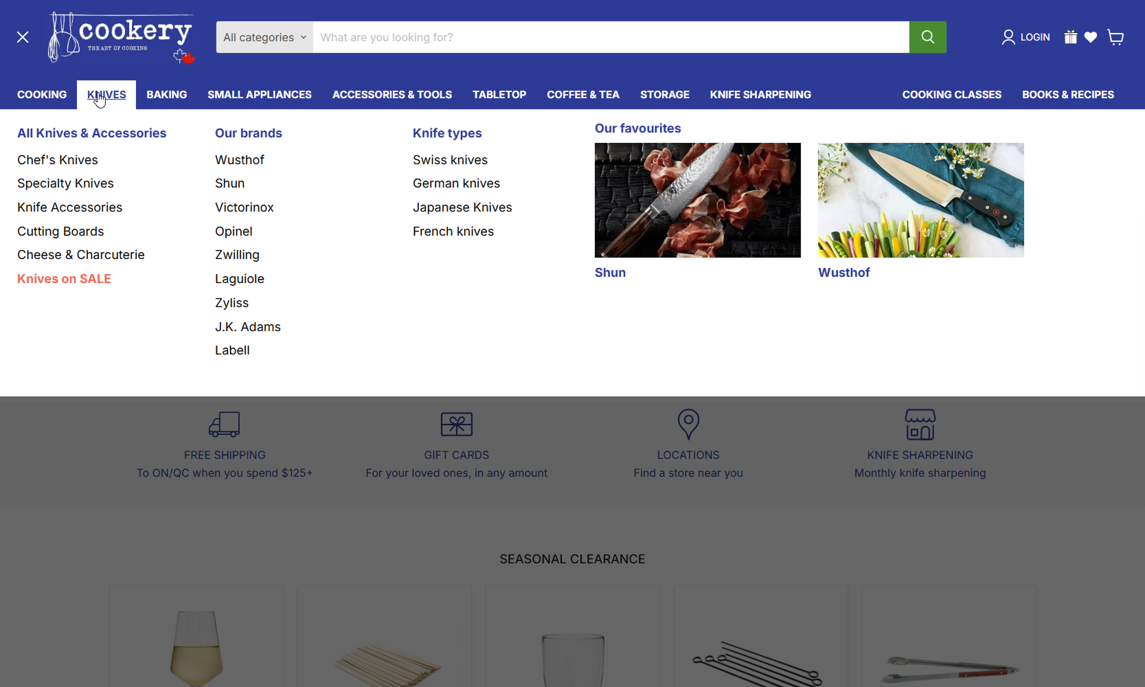
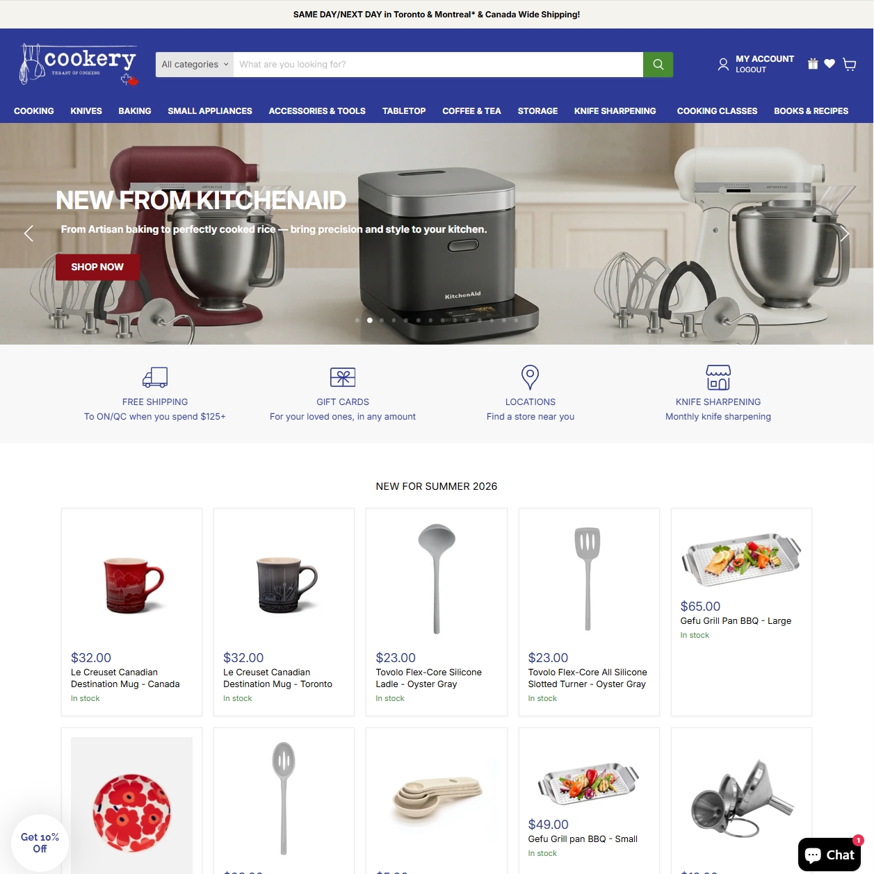
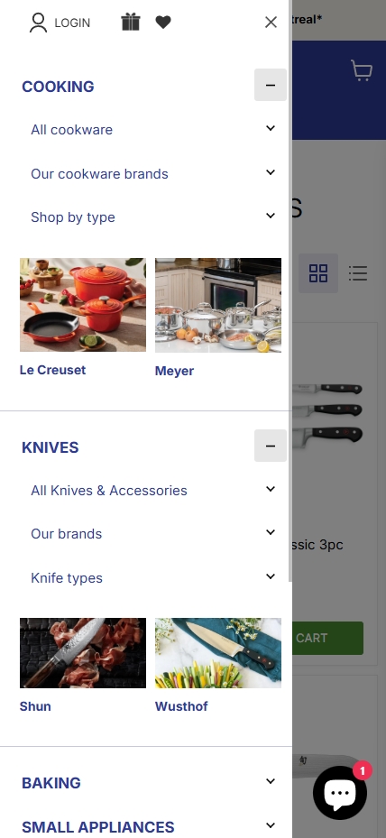
The main navigation was restructured to support multiple submenus per top-level item, with image placements available for up to two feature slots per menu (linking to collections or products). Content-focused sections — Books, Recipes, and Cooking Classes — were aligned to the right on desktop, visually separating them from the product navigation without removing them from the primary menu structure.
Homepage Banner System
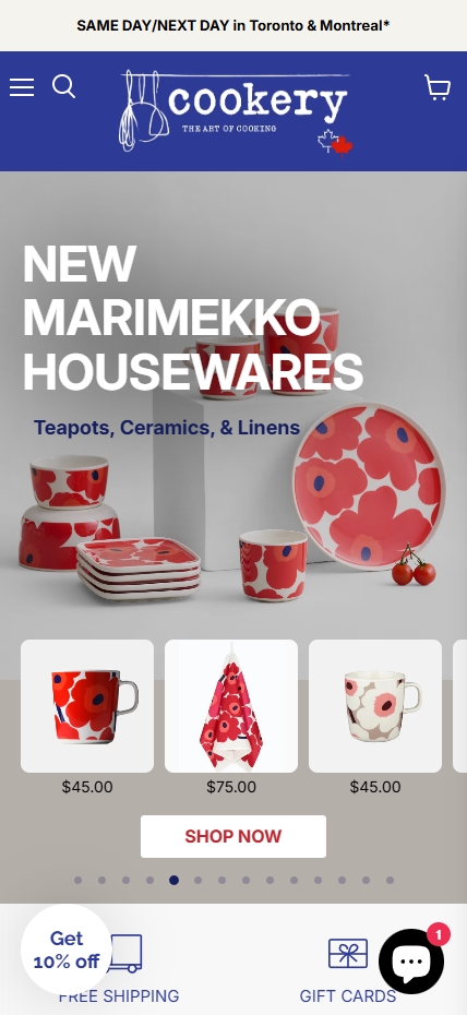
We replaced the existing homepage banner with a section-based system that separates mobile and desktop images. Each banner supports independent header, subheader, text colour, button style, and link configuration. On mobile, when the link points to a collection, a product grid from that collection loads inline below the banner (up to 12 products) — giving mobile users a direct path to browse without an additional page load.
Ongoing Growth Partnership
Following the initial implementation phase, Cookery moved onto a structured monthly engagement. Month two focused on content integration and bundle optimization. Month three brought a product quiz and translation improvements. Month four introduced a book-a-call flow and proactive recommendations for the next development phase. Months five and six are structured around new goal implementation and ad-hoc support — keeping the roadmap responsive to what the data shows.
Before / after
Before and after
Tech stack
- Platform Shopify
- Email Klaviyo
- Tool Metaobjects
- Automation AI content



Our contribution
Our contribution
- UX growth audit identifying conversion and discovery friction across the full store
- Product page overhaul: image gallery, sticky product details, lazy load optimization
- Metaobject-based color and size variant widgets with per-product metafield grouping
- Perfect Match upsell section with hand-picked product suggestions and inline add-to-cart
- Collection filter system built on product metafields, tags, and product details
- Full navigation rebuild with multi-level submenus and image placements
- Homepage banner system with separate mobile/desktop images and collection product lists
- Ongoing growth partnership: Klaviyo migration, bundles, quiz, translations, and new goal implementation
Key Outcomes
Key Outcomes
- Product pages rebuilt with sticky desktop details, mobile gallery navigation, and lazy load — reducing visual and interaction friction across devices
- Colour and size variant widgets now managed through native Shopify metaobjects — no apps required, full team control
- Perfect Match upsell section added to product pages with inline add-to-cart, surfacing complementary products without leaving the page
- Collection filter system live and self-managed via metafields and tags — extensible as inventory grows
- Navigation restructured to expose full category depth, including content-driven sections previously disconnected from the shopping flow
- Homepage banner system replaced with a flexible, responsive section supporting separate mobile and desktop assets
FAQs
FAQs
A structured audit maps friction across product discovery, product pages, and purchase flow — identifying where customers are dropping off and why. For Cookery, it produced a prioritised roadmap covering image experience, variant navigation, filtering, and site structure. The audit gave the team a clear sequence of improvements to act on, starting with the highest-impact changes first.
Yes, using metaobjects and metafields. Colors are defined in a metaobject and assigned per product; size variants are grouped through a product-level metafield linking related products. This keeps everything in Shopify’s native admin, removes app dependencies, and gives the team a repeatable setup process for new products.
By building it on product tags and metafields rather than hard-coded theme logic. New filter attributes are added by tagging products or filling metafields in the Shopify admin — no theme code changes required. The system is designed to grow with the catalogue without creating a maintenance burden.
Yes. We built a banner section where a collection link on mobile triggers an inline product grid below the banner — up to 12 products from that collection — rather than redirecting to a collection page. This keeps mobile users in the browsing flow without an extra page load.
We use a monthly roadmap structured around specific goals — content integrations, bundles, quiz, translations, and new feature implementation — with dedicated ad-hoc support capacity built in. Each month has defined deliverables and we surface proactive recommendations at the start of each cycle based on what the data and team priorities suggest.
Automated Shopify recommendations work well as a default — they require no setup and adapt to catalogue changes. Hand-picked suggestions are used where curation matters: accessory pairings, cookware sets, or products where the brand relationship justifies a specific recommendation. Having both options in the same component means the team only needs to intervene where it adds real value.

Talk to the founder
André de Freitas
Let's find the fastest win for your store.
Tell us where you're at — we'll help you find your clearest next step.
★ 4.9 Clutch
Shopify Plus Partner
200+ brands grown
Book a call
Pick a day
Pick a time (CET)
You'll talk directly with our founder — not a sales rep.